RAW COSMETICS
Client
Raw - Cosmetics
Media
Branding & Packaging
Year
2024
Brand Attributes
Sustainable | Nature | Fresh

Client
RAW is a beauty cosmetics brand that caters to young vegan individuals who have a passion for using natural skincare products. Based in Saint Maxime, South of France, RAW stands for sustainability.
goal
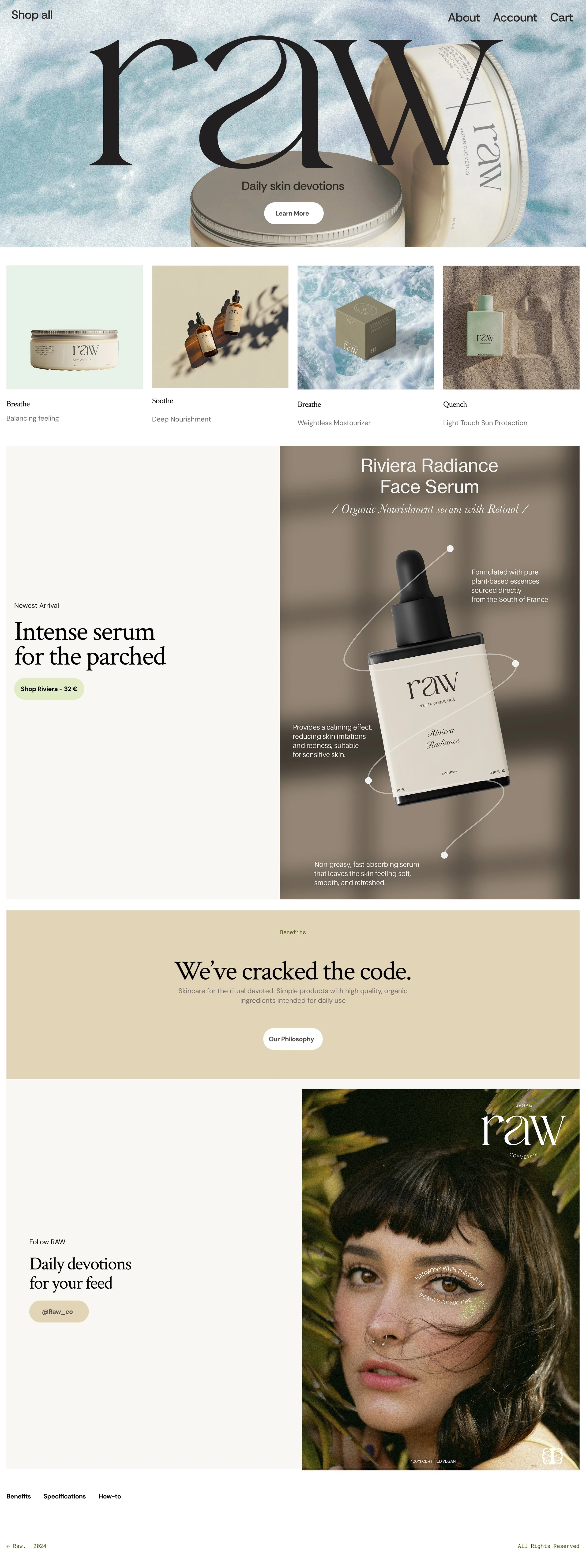
In collaboration with RAW, a vegan skincare brand based in the South of France, the goal was to shaping a visual identity that reflects their passion for sustainability and clean beauty. The project aimed to create a cohesive look across packaging and campaign assets, merging minimalist design with nature-inspired tones to appeal to a modern, eco-conscious audience.


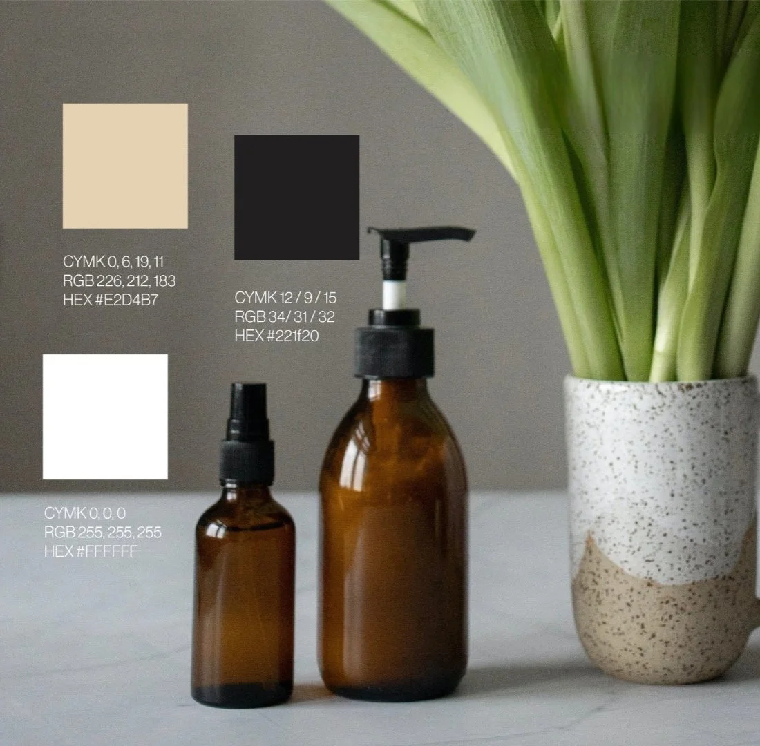
color palette
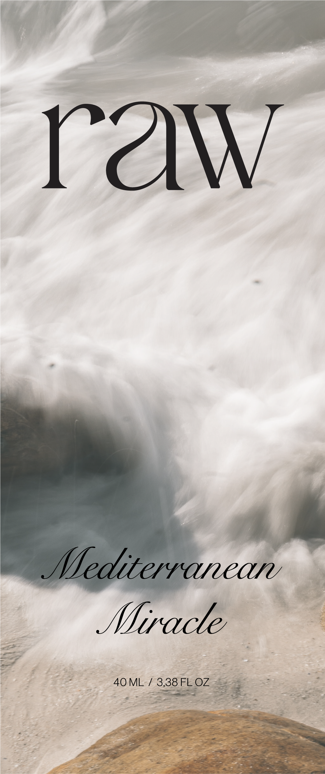
The color palette combines soft greens, earthy browns, and clean whites to reflect nature’s beauty and the purity of organic ingredients.


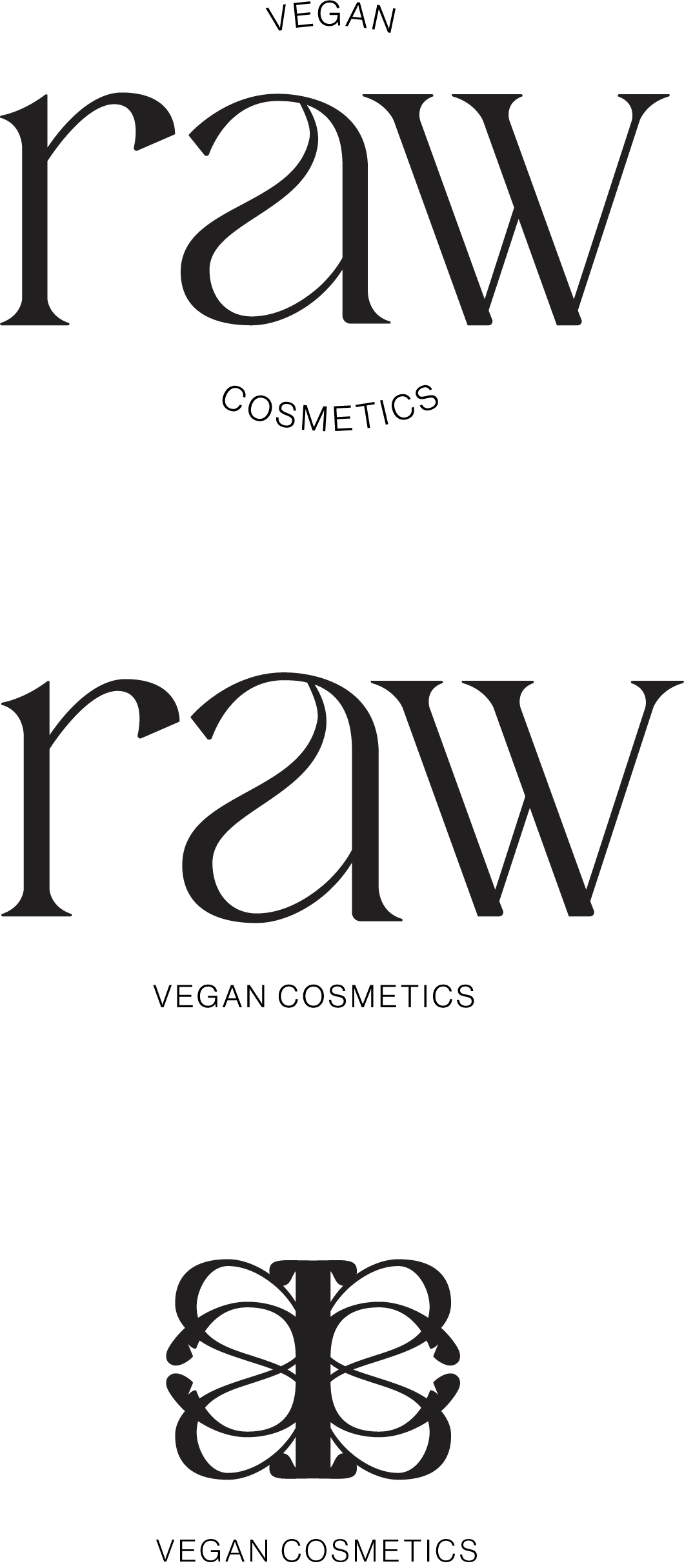
Brand Identity
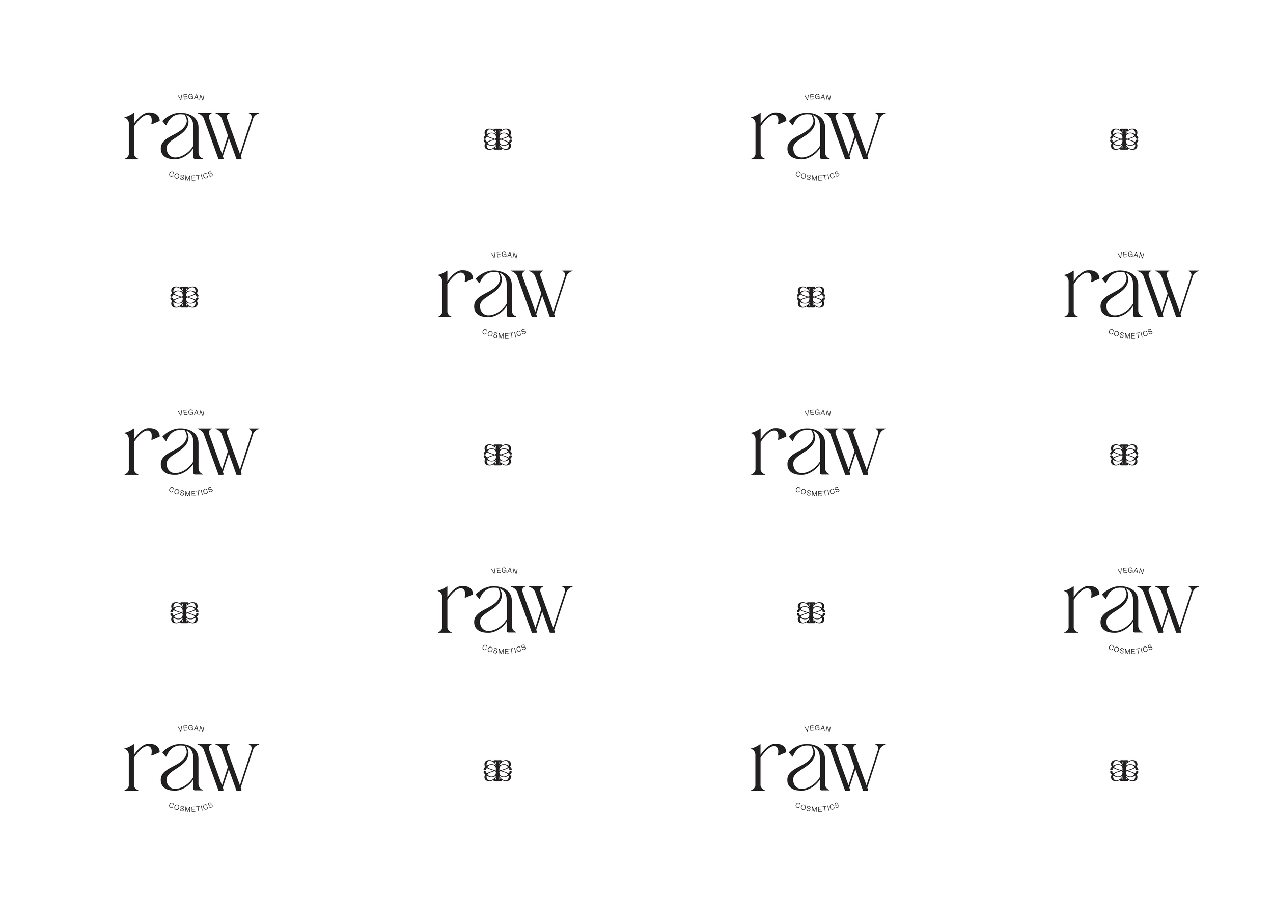
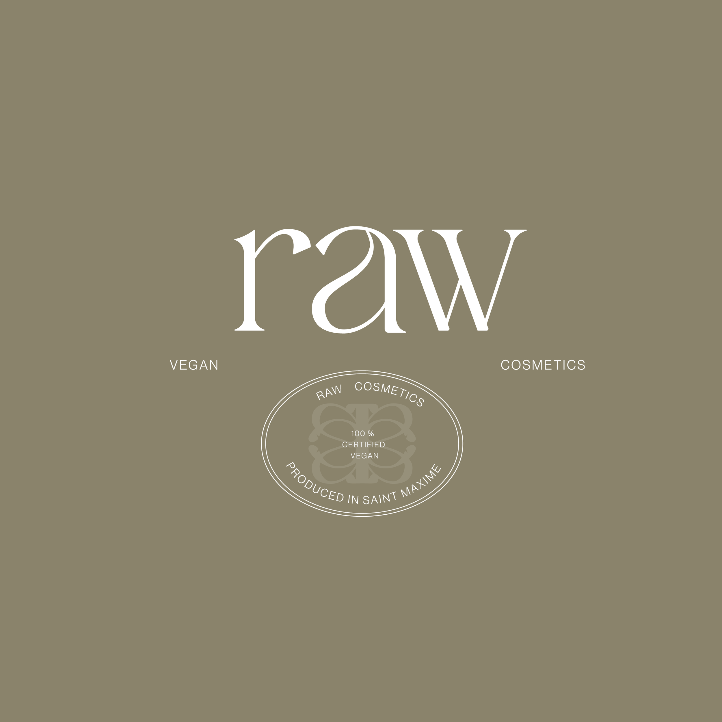
The visual identity of RAW evokes a sense of natural beauty and simplicity. The logo is clean and elegant. The use of natural colors like soft greens, earthy browns, and clean whites can create a harmonious and calming aesthetic. Incorporating elements inspired by the region‘s flora and fauna can further establish a connection with the brand‘s essence.
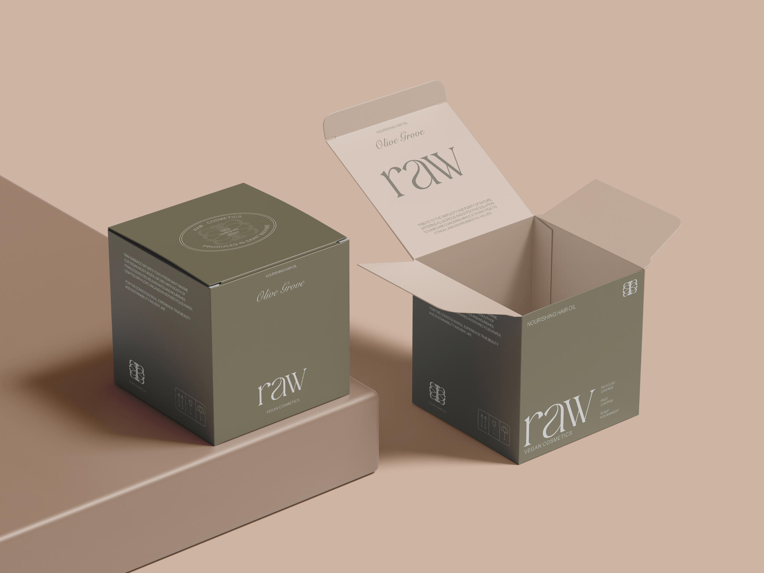
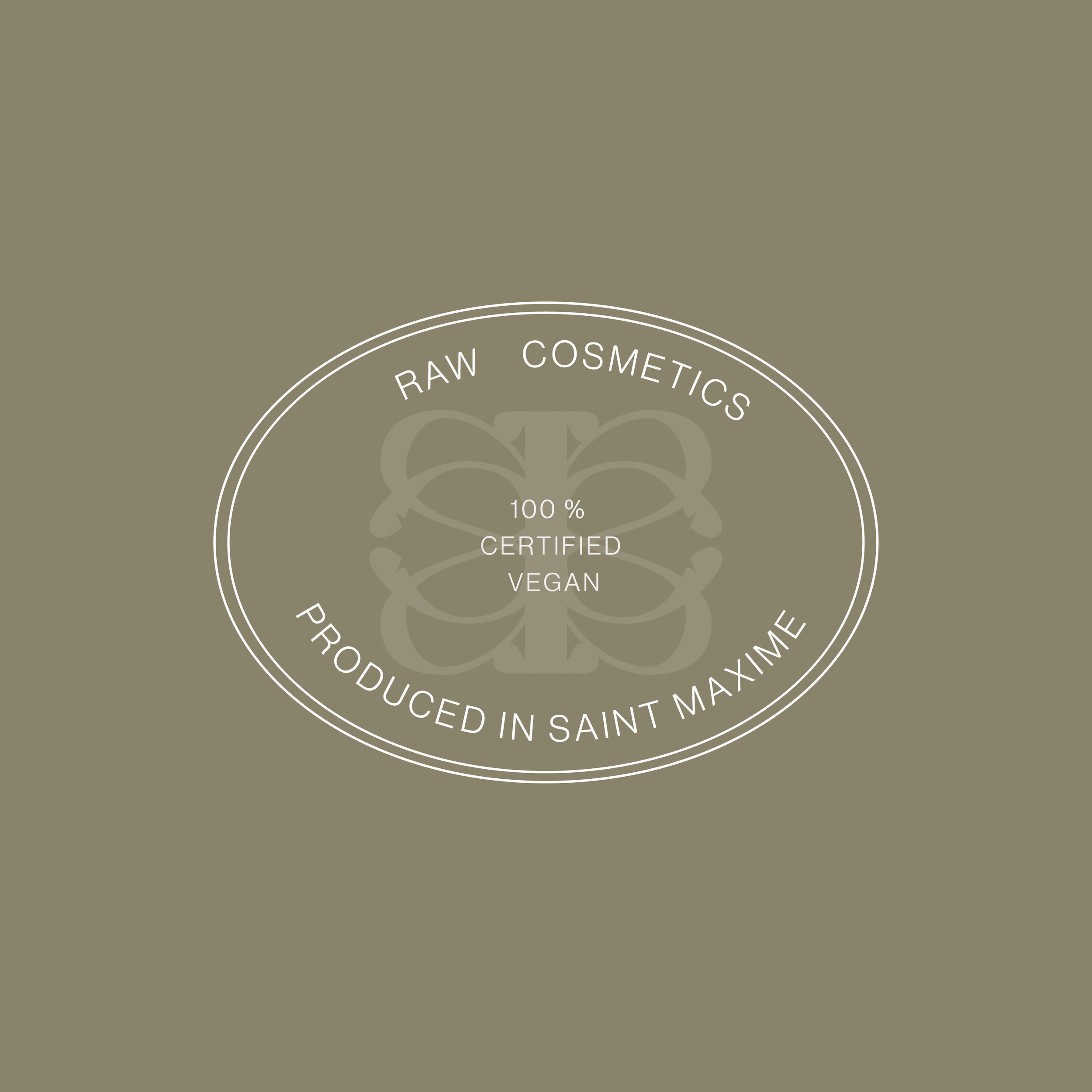
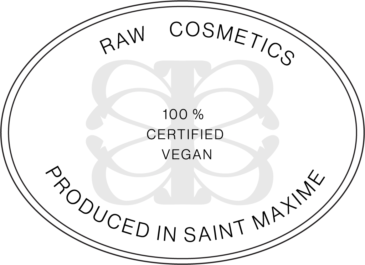
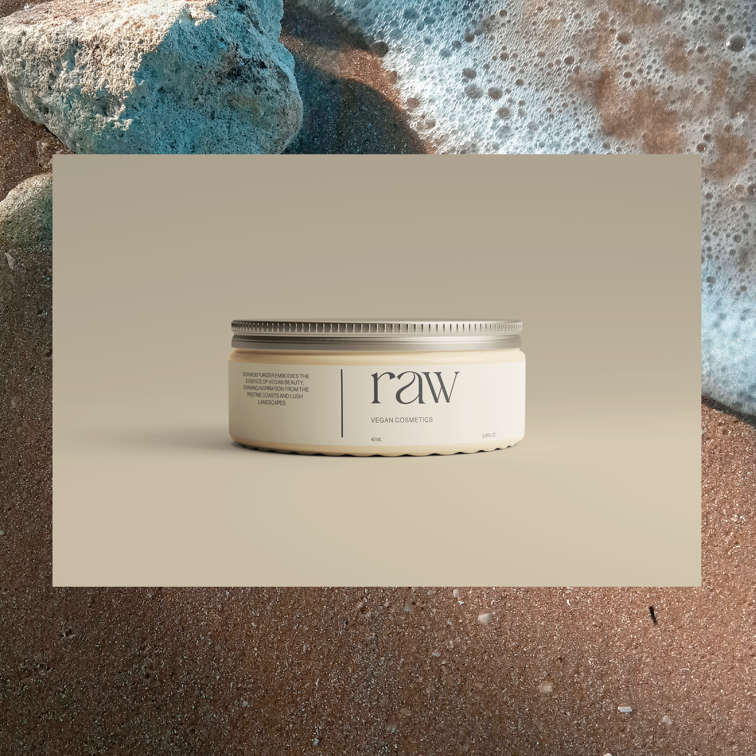
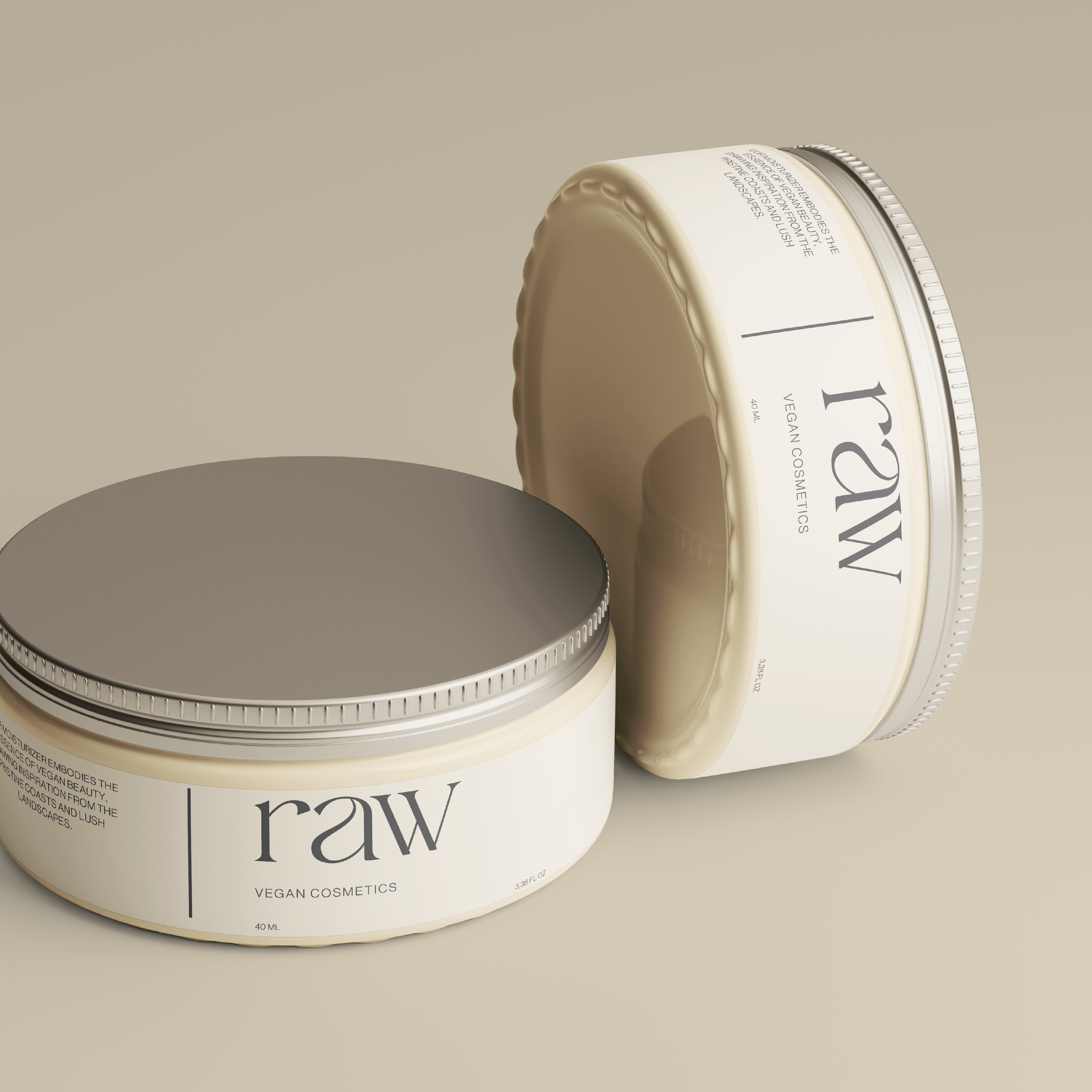
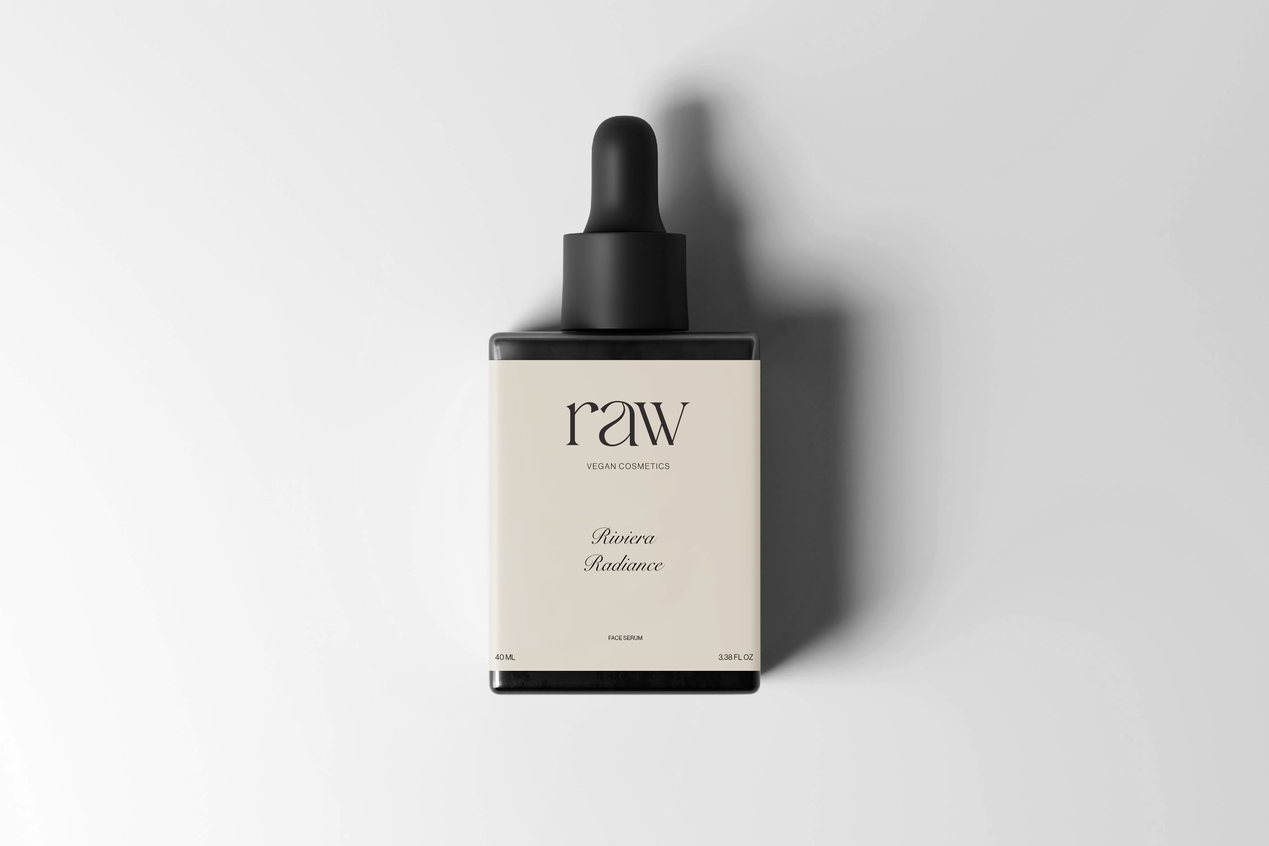
The Packaging
It reflects the brand’s commitment to sustainability and naturalness. Using 100% recycled paper for product boxes and containers, showcases the brand‘s dedication to eco-friendliness. The packaging design is minimalistic, with clear labeling and simple fonts, which emphasizes the purity of the products.
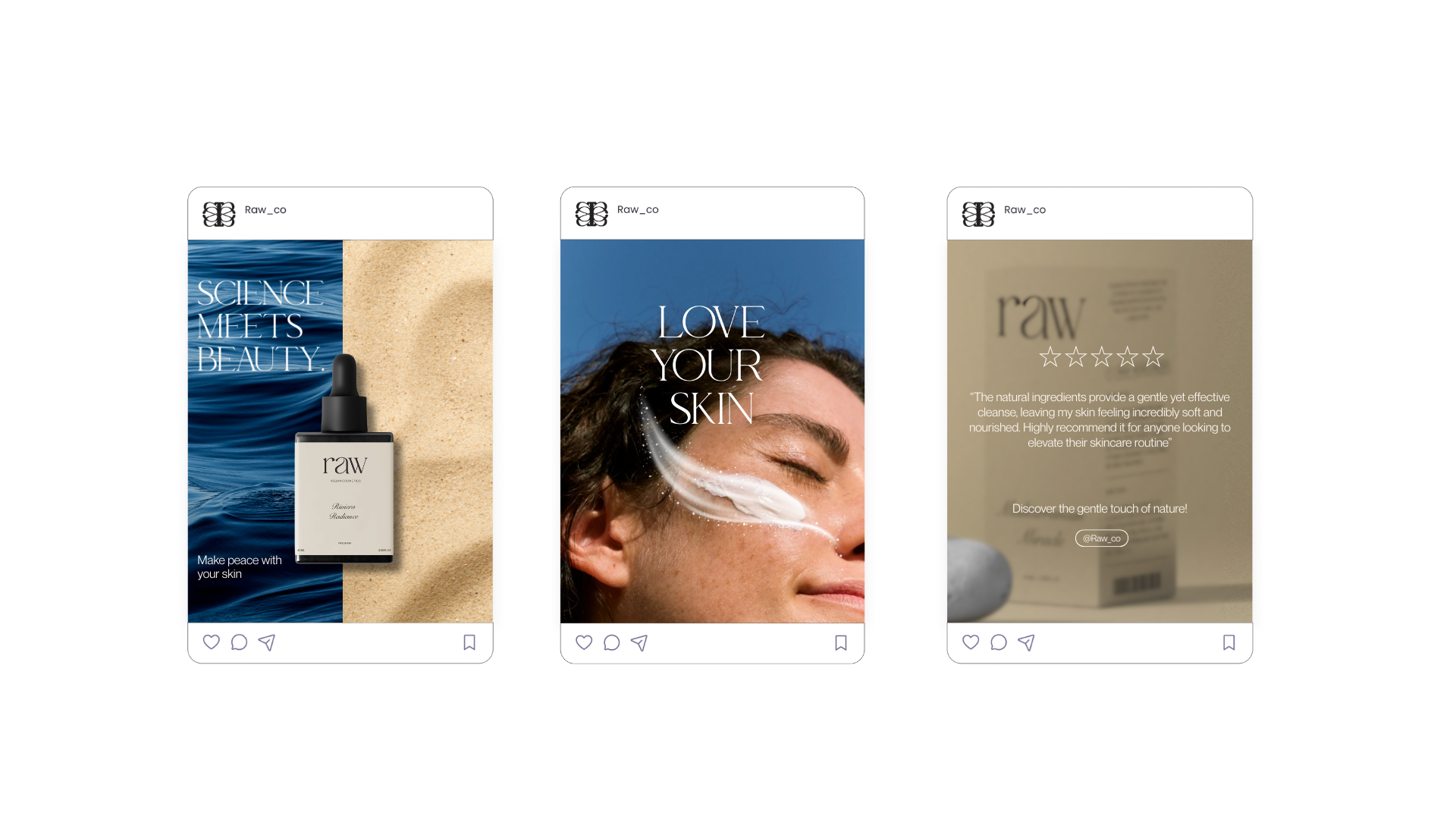
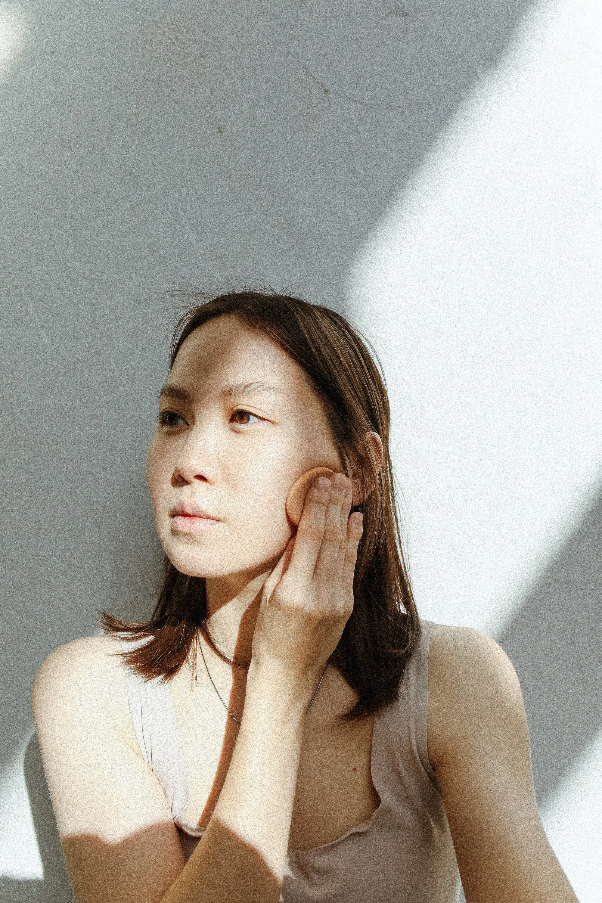
social media
Series of Instagram visuals blending minimalism with a tactile, nature-inspired feel. Each post highlights the brand’s core pillars: clean formulations, science-backed ingredients, and a deep respect for natural beauty. The tone is soft yet confident, aiming to build trust and invite users into a soothing skincare ritual rooted in both nature and clarity